Judging by the Cover: Album Covers in the Age of Streaming
Album art has never mattered more, yet it has never felt more fragile. In a world of thumbnails and endless scroll, we meet records with our eyes before our ears — and that first image quietly shapes how we discover, approach, and remember the music.

In a recent Instagram story, an unnamed musician voiced frustration over comments criticizing the artwork for his latest album. It made me wonder: in today’s landscape of digital music consumption, is it really fair to judge the music itself by its album art?
On one hand, this unnamed musician has a point — how can the quality of one artistic medium be evaluated through another? Judging music by its cover alone seems inherently unfair. Yet, album art is an artistic expression of its own, often serving as a window into the artist’s intent, mood, and message. It stands as both a complement to the music and an independent work that can be appreciated in isolation.
This tension raises a broader question about the role and relevance of album artwork in the streaming era, when visual impressions often precede the act of listening itself
Album Covers as Artistic Mediums for Visual Identity
Album covers are art forms in their own right. They serve as visual and emotional extensions of the music — expressive indicators of an artist’s identity: through intent, statement, and vision. While the music is what ultimately draws us in, there’s something undeniably powerful about a cohesive pairing of sound and imagery working in harmony.
On a personal note, I’ve found it increasingly rare to encounter albums that achieve that perfect balance. Many of my favorite covers leave me with more questions than answers. Damu The Fudgemunk’s Vignettes (2017) captures this perfectly. When I first encountered the record, I wondered: What’s going on here? Where are we?
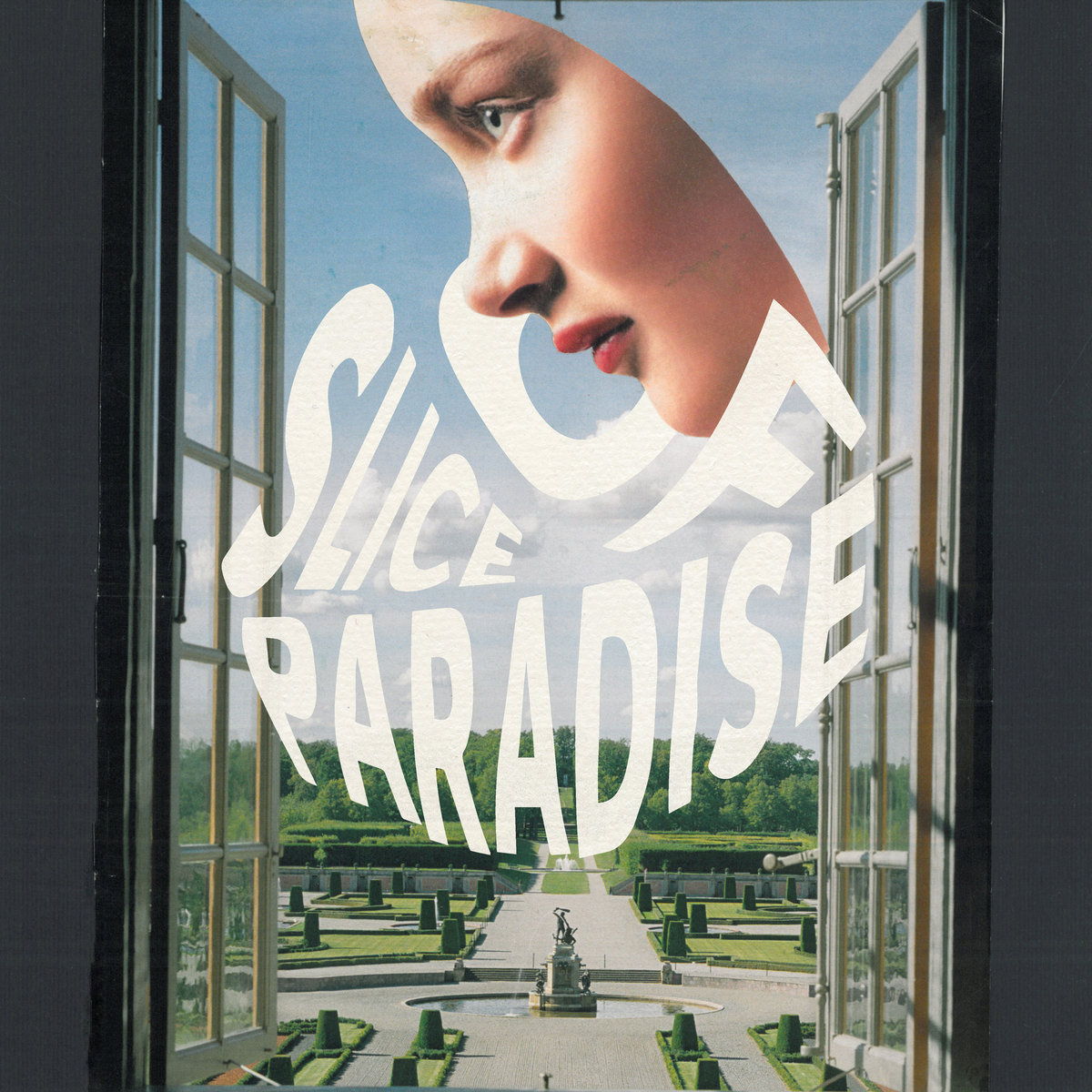
Another alumnus of the now‑defunct Redefinition Records, Klaus Layer teamed up with Figub Brazlevič on Slice of Paradise (2018), a record whose artwork grows stranger the longer you look at it. The absurd, surreal image of a face hovering over a chateau‑like estate mirrors the music’s tension between grounded hip‑hop and dreamlike abstraction. Across the album, the duo stay rooted in traditional boom‑bap while drifting into hazy, psychedelic textures, through flute notes leaving the listener in a vivid, slightly unreal soundscape.
More recently in mainstream music, regardless of one’s opinion on the controversy surrounding Sabrina Carpenter’s Man’s Best Friend, its cover is undeniably magnetic. The image provokes curiosity — Why is she on all fours? What’s she trying to say? What exactly is happening here? Whether you love or dislike it, the art compels you to look closer and engage with the music in context.
The UK jazz scene offers several examples of this strong sound-image synergy. Black Focus (2016) by Yussef Kamaal uses stylized Arabic script alongside a crisp Futura-style font, reflecting the record’s cultural fusion and sonic experimentation. Aesthetically, MALIK (2025) by Venna achieves something similar through a different energy: minimal, yet luxurious. The cover radiates confidence: even before hearing a note, you can imagine its Coltrane-like effortless cool.

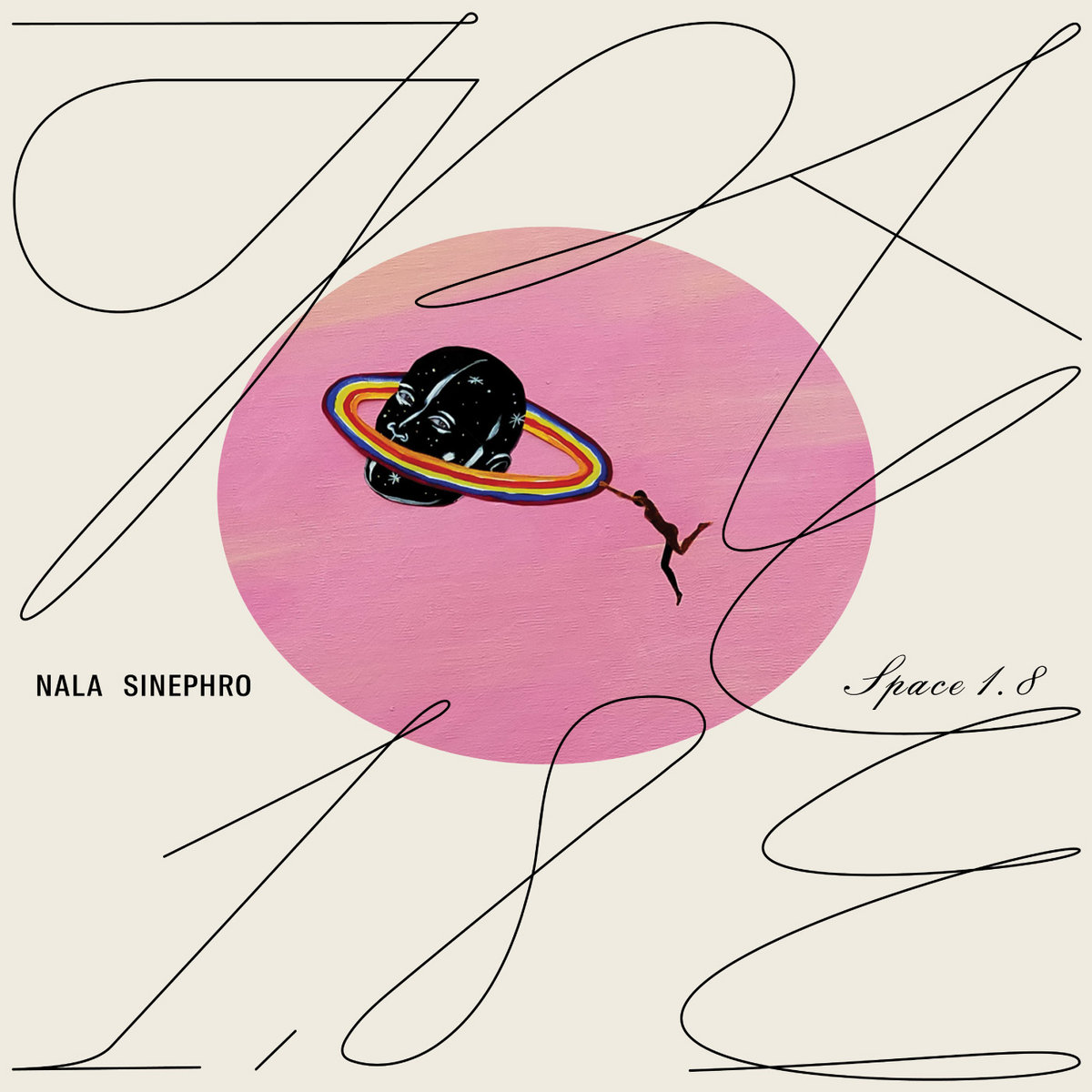
Nala Sinephro's Space 1.8 (2021) and Endlessness (2024) leaves you in a strange space of abstractness. I find her two album covers - Space 1.8 in particular, a rather tasteful take on contemporary modern art.
Then there’s My Back Was a Bridge for You to Cross (2023) by Anohni and the Johnsons, which takes a more politicized and confrontational approach. The stark black-and-white portrait of activist Marsha P. Johnson transforms the cover into a statement about vulnerability, grief, and resistance. It’s uncomfortable yet moving — a reminder of how visuals can carry deep emotional and social weight. A representation of the trails and tribulations of the modern and civilized world.
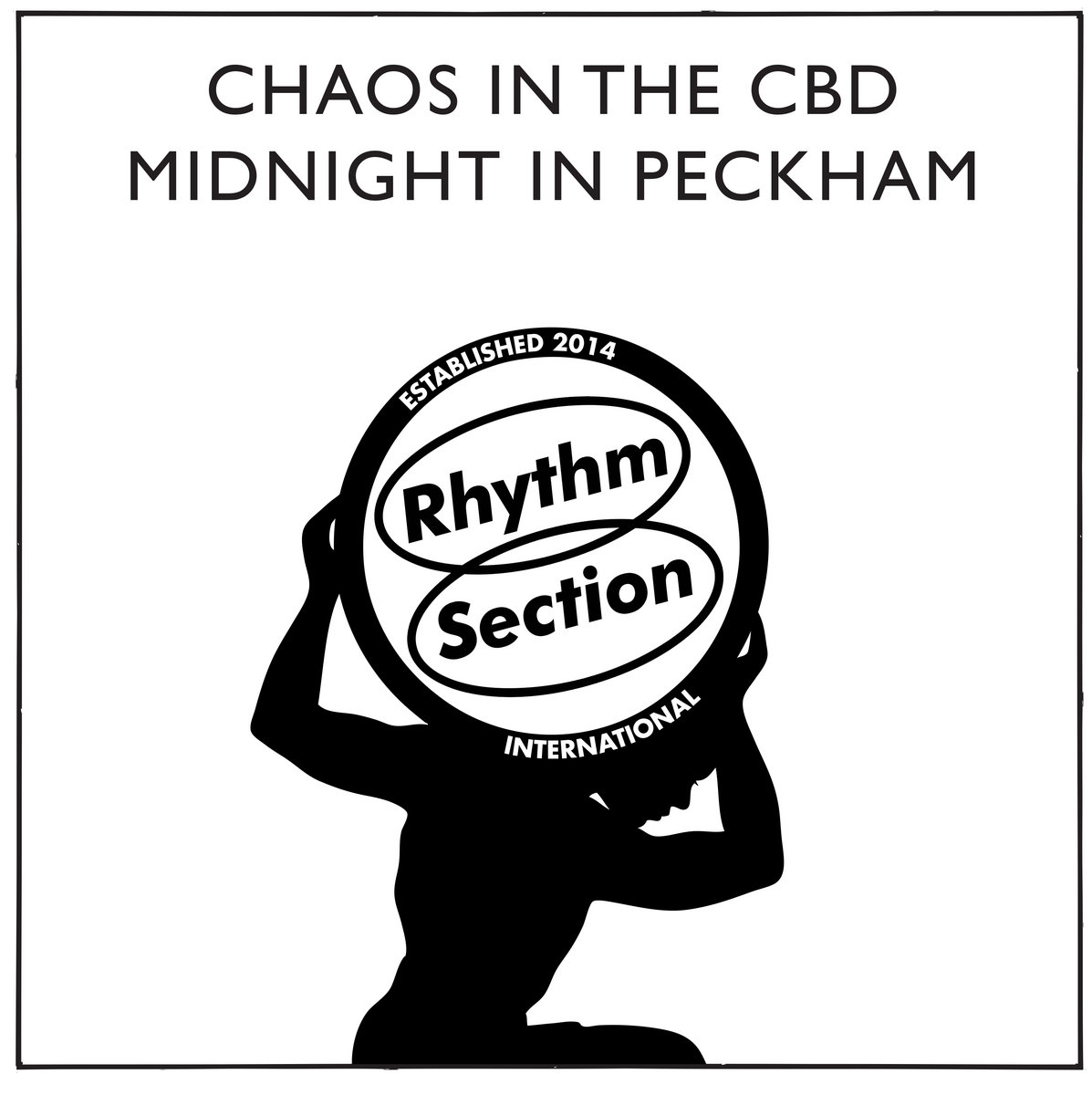
Indie record label, Rhythm Section International, uses the minimal image of a lone figure hoisting its globe‑like logo as a simple but powerful emblem of a shared musical world. Across releases by artists like Chaos in the CBD, Neue Grafik, and Al Dobson Jr., that recurring mark functions almost like an ongoing album cover, a visual shorthand for the unity, community, and history the label grew out of, equally legible on a 12‑inch sleeve or as a tiny streaming thumbnail.
The Role of Album Art in the Streaming Era
In the streaming age, visuals often make the first impression. Album art is usually the first thing we see, and it can determine whether we’re curious enough to press play. For many listeners, that image serves as an entry point into the music — the deciding factor between engaging or scrolling past.
With attention spans fractured by the constant scroll, the old argument that people should “just listen for the music” no longer holds. Today, the full package — both visual and sonic — shapes how we approach, experience, evaluate, and even discover what’s worth listening to.
I’ve always believed that great album art should extend beyond the screen. It’s the kind of image you’d proudly display on a vinyl sleeve, cassette, CD, or t-shirt — artwork that feels at home both as a physical object and as a digital thumbnail. When album art translates seamlessly across formats, it reflects a coherence between the artist’s visual identity and their musical vision. And in an industry where musicians are largely at the mercy of streaming platforms, ensuring that dedicated fans can connect and support you through other tangible means is more vital than ever.
Thus, while I’m all for judging the music for what it is, it’s another thing to disregard your audience and tell them to look past the visuals. In the streaming era, listeners engage first with what they see — and the artists who understand that are often the ones shaping the next wave of cultural aesthetics.